 Pictures of Real Tcl/Tk Applications
 Pictures of Real Tcl/Tk Applications
This page will walk you through a lightning overview of the Dashboard GUI design tool. For real information see Related Papers and/or DEIMOS homepage.
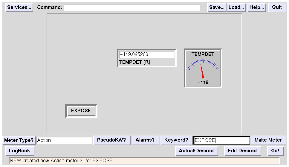
An Ad Hoc Dashboard, in Progress
Start with a blank Dashboard. Choose a Service (Instrument, Telescope, something that has a discrete KTL shareable object library to load). Choose a Keyword name (if you forget them, the Keywords button will bring up a list). Choose a graphical metaphor (Meter Type) from a list of stuff like Gas Gauge, Dial Gauge, Strip Chart, Text Box, Button, etc. Hit Make Meter, and the meter appears on the dashboard. You can grab it and drag it around to any position.
An Ad Hoc Dashboard, A Couple of Minutes Later
Here we've not only created a couple more objects and dragged them around freely, we've also altered their appearance by editing their attributes....
Editing Dashboard Object Conditions
... using the attribute editor. Every object on the dashboard has a Normal condition (we edited that to change the normal, default appearance of the objects) and an arbitrary number of Conditional conditions. These are applied only if the Boolean expression associated with them evaluates to True.
Dashboard is handy for prototyping. This was the first sketch for DEIMOS. No one liked it. It takes up way too much space. But it only took a half a day to construct, so that's all right. Throw it away and try again.
This was the second draft for DEIMOS. We liked that better, but the astronomers said there were too many colours. Oh well. So what would they like better?
Working Prototype DEIMOS (at rest)
I sat down with the lead astronomer (principal investigator) and in real time changed the dashboard to meet her preferences. This is what she liked.
Working Prototype DEIMOS (desired ne actual)
Here's that conditional attribute stuff again. If the user changes the Desired value (bottom row of entry boxes) from the Actual value (top row) then the Dashboard immediately flags this change by altering the colour of the surrounding decoration. That way the user can see immediately that they intend to move the instrument to a new position. Read the Tcl97 paper for more information about Dashboard.
As it happens, no one liked the "hospital green" colour scheme after they had stared at it for a while. Now that the general layout and concept was approved by all, Dr. Drew Phillips took over and refined the design considerably. After about 6 weeks of his effort, it looked more like this:
This is the version that DEIMOS users will eventually see. Note the toned-down colour scheme (carefully crafted after many readings of Tufte's work on data presentation). In this illustration, the Grating is in Mirror position, so it has moved "out of" the light path. The Slitmask selected is Clear (no mask) so it has also moved down, showing that only the filter stage and focus are actively affecting the photons on their way to the dewar window.
Six weeks seems like a lot, when you consider that the early prototypes took on the order of days. Dr. Phillips, however, was working out sophisticated features not related to literal realtime control: for example, the image of the CCD mosaic changes its shape as you change the observing mode. Warnings pop up when the instrument seems to be in a contradictory state (you have the lamps on, but the hatch open, for example). The menus by which the user selects stage positions had to be made immune to instrument configuration changes. Seven or more popup subpanels were designed. Automatic FITS filename incrementing and OBJECT keyword content were added. In other words, the UI got a whole lot smarter as well as prettier.
Here's the final version with a move pending. Notice the lower-key use of yellow. The user plans to go to filter R. The filter "desired" position is lit up yellow, and so is the Go button (a subtle hint that you ought to push the Go button if you want anything to move).
DEIMOS Draft User Manual, PostScript This draft of the User Manual for observers was presented at the DEIMOS GUI Review Day (see DEIMOS homepage for review dates and docs).
Early Version of PFCAM interface (PostScript)
The finished interface is very similar. This is a much simpler interface than DEIMOS. It took 1 day to create, another 2-3 days to refine.
ESI GUI was modelled on DEIMOS and took less than a month (effort, not wallclock) to build. It was reviewed using the Ksim simulator which emulates the real KTL instrument well enough for users to "get a feel" for the interface.
Most of this panel is one simple multi-keyword widget.
DEIMOS and ESI share this start-of-night setup panel in which the user initializes the datataking system and UI for the night.
This snap was taken during a simulated exposure. It shows several state/appearance changes in the main screen when exposure is in progress.
de@ucolick.org